zaterdag 27 juni 2015

North Carolina Alternative Flag

North Carolina flag proposal redesign alternative
Andrew Cusack describes an interesting grant of arms by the British College of Arms to the senate of the state of North Carolina.
While the design itself is flawless, I'm rather surprised the senators didn't take offense at the blatant colonialist symbolism. The Senate adopted it as its own arms anyway (which did not alter the status of the state's seal.)
At any rate, the design is a perfect basis for a banner of arms, which could provide for an alternative to the state's present, characteristically drab, flag.  

maandag 15 juni 2015

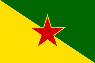
Flag of French Guiana Quick Fix

French Guiana flag drapeau Guyane française
Flag of French Guiana
A quick fix for the flag of French Guiana (or 'East Guiana'?) I think it would look so much better with a larger, outlined star.
This flag is pretty unofficial. It seems to have been adopted by the council of the département of Guyane, while the higher région level of government doesn't use it. France, which considers French Guiana an integral part of its territory, wants the French flag to be used for all international purposes. Yet it is funny to see how this flag is basically forced upon the guyanais by Caribbean countries. It often pops up to represent the territory at Caribbean sport events, for example.

woensdag 1 oktober 2014

Hong Kong Independence or Autonomy Flag

Hong Kong Autonomy or Independence Flag Proposal Redesign
Amidst the protest for greater autonomy for Hong Kong, the old colonial flag of the territory has crept up. A Hong Kong Autonomy Movement uses a blue flag with the complete colonial coat of arms on it, thus omitting the Union Jack. I made a banner of arms of Hong Kong, comparable to for instance the flag of Gibraltar. 
I took the naval crown from the lovely people at Wikipedia.
I can send a SVG file to those who wish to reproduce this flag. 

Here is also a simplified flag based on the same coat of arms.
Hong Kong Autonomy or Independence Flag Proposal Redesign

zaterdag 9 augustus 2014

Flag of Paramaribo

Some two years ago I moved to Paramaribo, the capital city of Suriname. Suriname doesn't seem to have subnational official flags. The etymology of the name Paramaribo is clouded in mystery, but the recently deceased prominent Surinamese historian André Loor puts forward in his latest book that the most credible one is that Paramaribo means "city near the rainbow stream" in the indigenous Karib language. In the local language Sranantongo, Paramaribo is often referred to as 'foto', simply 'city'. The word derives from the Dutch 'fort' (fortress), referring to Fort Zeelandia, the settlement around which the city grew.
In my design I combined rainbow colours with the outline of a fortress in the colours of the national flag, symbolizing Paramaribo's central position as capital of the nation.

zondag 9 december 2012

Connecticut State Flag Redesign

Andrew Cusack suggested on his interesting blog that Massachusetts might be better of with a banner of it's arms in stead of its present flag.
Massachusetts' flag now, with its coat of arms in the center:

And the arms 'translated' into a banner:


Zoom! Decidedly better.

I suppose several other states might benefit from the same treatment. Connecticut's ancient arms feature three grape-vines. This is the flag of Connecticut now:


So a banner of the arms would look like this:
Connecticut State Flag Redesign (Banner of Arms)

Just gave it a tiny green border to put focus on the design. Cute enough, right?

maandag 26 november 2012

Washington State Flag Redesign

A number of sites have sprung up to 'redesign' the flags of the states of the United States. An example is the hilarious Your State Flag Stinks. US states' flags are usually awful. They consist of a plain field, with the (usually equally awful) state seal in the center.

To me, one of the more baffling ones is the flag of Washington state. Washington's face features prominently on the seal, and therefore on the flag. Kim Il-Sung, you say? No comment.

Paradoxically, the flag of Washington DC is considered America's best flag. It's a heraldic banner of Washington's personal coat of arms, which is elegant and simple.

I decided to take on the state flag of Washington. I think Washington's arms are not exhausted yet as a source of good flag design. And probably a flag based on his arms would resonate with Washington's inhabitants (a good symbol needs a good story, I suppose).
Washington State Flag Redesign (Mon)

The first idea I had is completely counter-intuitive. I took Washington's coat of arms, translated it into a square (Dutch flag tradition dictates shields should be avoided on flags), tilted it, and put it in the center of the existing green cloth. I think the result is reminiscent of Japanese flag design. If you find it revolting, I'll completely accept that. Yet for some reason I think it's irresistible.

Anyway, now for my REAL proposal. Let's keep the green. Washington calls itself The Evergreen State, anyway. I took the red bars and stars of the arms, bordered them white, placed them on the green. I centered the design towards the hoist (as I think a good flag should be), hence the stars next to the mast, rather than at the top, as in the District of Columbia flag.

Washington State Flag Redesign (Heraldic Flag)
So, this isn't strictly a heraldic banner. But the reference to the Washington arms is obvious, yet it's distinct from DC's flag. The whole is simple yet feels quite American, I guess.

vrijdag 13 juli 2012

Alternatief gemeentewapen Hollands Kroon


Onlangs heeft de nieuwe fusiegemeente Hollands Kroon een nieuw wapen aangenomen. Dit wapen doet mij als heraldicus pijn aan de ogen. Ik zal proberen uit te leggen waarom.
Het nieuwe wapen gaat voorbij aan de wapens van de samengevoegde gemeenten. Het probeert een ‘sprekend wapen’ te zijn: zo’n wapen beeldt direct de naam van de ‘drager’, de eigenaar van het schild uit. Bijvoorbeeld, een vos voor iemand die De Vos heet.
Dit wapen is de rode leeuw met blauwe tong en klauwen van het graafschap Holland. Het komt als zodanig voor in de wapens van Zuid- en Noord-Holland. De leeuw in het schild is gekroond met een koninklijke kroon.
Waarom is dit wapen niet goed?
  1. Het is op het eerste gezicht moeilijk te onderscheiden van andere wapens. Je kunt het makkelijk aanzien voor het wapen van Zuid-Holland, bijvoorbeeld.
  2. De ‘kroon’ uit de naam ‘Hollands Kroon’ is een klein detail in het schild.
  3. De gebruikte kroon, een negentiende-eeuwse koningskroon, wordt normaal niet op de kop van een heraldisch beest in het schild gezet. Je zou daar liever een simpeler, middeleeuwser model verwachten.
  4. De gebruikte kroon is de kroon van heel Nederland, niet alleen van het graafschap Holland waar de gemeentenaam naar verwijst.
Tot zover de details. Belangrijker is dat de heraldische geschiedenis van de samengevoegde gemeenten niet doorleeft in een nieuw wapen. Ik heb geen archiefonderzoek kunnen doen, maar hier wat ik uit de leuke site NGW opmaak.

  1. De in 1970 opgeheven gemeente Wieringerwaard had een wapen dat al in 1611 is verleend door de Staten van Holland. Dat wapen vertoonde twee zwanen met twee kroontjes, en volgens de wapenbeschrijving werd het schild vastgehouden door een leeuw die slikhaken in zijn klauwen had.
  2. Eén van die zwanen werd toegevoegd aan het wapen van de in 1990 opgeheven gemeente Barsingerhorn. Daar werden toen de kleuren zwart en goud gebruikt, naar ik aanneem waren daar historische redenen voor. Begin 19e eeuw werden wapens vaak verleend in de kleuren blauw en geel, terwijl daarvoor andere kleuren werden gebruikt.
  3. In het wapen van Wieringen komen twee ganzen voor. Geen zwanen dus. Maar: dit is een erg slordig wapen, zoals wel meer wapens die kort na de oprichting van het Koninkrijk der Nederlanden in 1815 zijn verleend. Het is niet uitgesloten dat die ganzen eigenlijk zwanen moesten voorstellen.
  4. In meerdere waterschapswapens in deze regio komen ook zwanen en slikhaken voor.
  5. Het wapen van Anna Paulowna, een gemeente die in Hollands Kroon opging, komt uit de 19e eeuw en beeldt het lokale landschap uit.
  6. Het wapen van de ex-gemeente Niedorp is fraai, maar historiserend. Dat wil zeggen dat het later (in dit geval: in de jaren zeventig) is bedacht om historische gebeurtenissen in de gemeente te symboliseren.
  7. Dat geldt ook voor de opgeheven gemeente Wieringermeer.

Voor mijn ontwerp heb ik het oude wapen van Wieringerwaard uit 1611 ‘hergebruikt’. De ene schildhouder is een leeuw, zoals de schilhouders van Wieringerwaard en Anna Paulowna. Ik heb er een Hollandse leeuw van gemaakt (zoals in het wapen van Niedorp) en hem een slikhaak in de klauwen gegeven (zoals in het wapen van Wieringenwaard, èn een kenmerkend lokaal element). De andere schildhouder is één van de meerminnen uit het wapen van Wieringermeer.
Alternatief wapen Hollands Kroon

Hierbij een snelle schets hoe het eruit zou zien. Ik heb de leeuw en de kroon van Wikipedia geplukt!
Benieuwd naar reacties van Hollandskroners!